Please scroll to the lowest part for the newest updates:)
Thank YOU!!!!!!! ENJOY!!!:D
!!!!!!! 2-DIMENSIONAL DESIGN !!!!!!!
~Week 1 to Week 3~
Unconventional self-portrait
This week during week 1, Miss Lisa is not in at the moment and can only attend classes on week 2. Nevertheless, she gave us our first assignment, which was to do a self-portrait of ourselves. She sent us the link to the assignment details on our facebook group page. We are to do some research on the topic, which is self-portraits, and then proceed to do our respective self-portraits. We are expected to show Miss Lisa our progress of our assignment so far next Monday. The final due date for this assignment is during week 3.
I did some research on different self-portraits, and there are so many types of self-portraits that I cannot make up my mind on what kind of self-portrait to do. With very little details, we are all expected to have our own ideas on this topic, and I am struggling as I am so used to having boundaries and specific directions, but since now the directions are so few, I am left here racking my brain out for answers of my own. I really want to come out with my own unique style of self-portrait and make Miss Lisa proud of my work. Therefore, I went and did some more researching and thought long and hard for ideas to come to my mind.
As I was in the middle of doing my researching, I also went on pinterest and other social websites in search of what other people's point of view of self-portraits are. I happened to go to the DIY section of pinterest, and I found out about DIY ragdolls and dolls made out of string. I immediately was interested in these interesting DIYs. At the same time, I had a flashback of that morning when I was walking past the Student Life Centre and a booth was selling badges and cute little handmade crochet dolls. I saw a girl doll and an adorable turtle doll, and I reallt wanted to buy one of them, except I was broke and the dolls each cost RM35, which I could not afford at all. That flashback of the incident made me even more motivated to make a doll as my self-portrait. I can kill two birds with one stone, maybe even three birds because on one hand, its much cheaper than buying the crochet doll, I can get to use it as my assignment, and I get to learn how to make a cute ragdoll. I just hope that Miss Lisa will accept this idea of mine for my assignment.
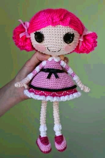
I went to my favorite research place online, Pinterest! And I searched lalaloopsy doll. These beauties came up!!!:)


First, I went to YouTube to search for ideas on how to make dolls using various methods, and I found a few methods, some more complicated and requiring sewing. I will post the links below:
http://www.youtube.com/watch?v=IRXc4i9cK_E (I really hope I can make this doll because I really love the outcome of it!)
http://www.youtube.com/watch?v=NO5JTZn8e4A (This one is a very good idea too!)
http://www.youtube.com/watch?v=aH3HLV1gK7I (These are my backup plans:)
http://www.youtube.com/watch?v=OUuSXFbTZbo
As I had only gotten this amazing idea on the Saturday before we have to present to Miss Lisa our ideas, I only have 2 more days to buy materials and make an example ragdoll for Miss Lisa to see. But first, I will have to make some sketches on the colour of the doll and its clothes and hair, and also the materials required to make the doll. I am crossing my fingers and toes that this will go well and that my doll will turn put pretty and cute instead of it being ugly and disfigured.
My planning before I mad the first doll:


I bought the materials on Sunday, and made the doll on Sunday night. Instead of following the directions of the YouTube video, I made the doll my own way, but using the YouTube videos to help in my first time of doll-making. I only managed to make the head, body, and hands of the doll that night, but it was okay as Miss Lisa only wanted to see my progress. I was quite satisfied with my half-doll, but my friends all said it looked like a potato, especially when it was also skin-coloured, but I take that as a compliment because potatoes look so cute, and I was aiming for my doll to look cute.

When Miss Lisa saw it, she liked the doll I was making, but she told me the doll on my sketch was better than the doll I was making as the sketch's doll has a more oval shape to the head and the larger proportion of the head looks more adorable. She loved the idea that I was making a doll, and I am very glad and relieved that she likes it.
I went home to create another doll, this time multi-coloured, using my colourful socks that I brought here to my dorm, but did not use, so I figured that I could turn them into a cute sock doll. I use each colour on each body part to represent the emotions I felt throughout my previous semester. The visible stitches also represent that all my experiences in my previous semester had "made" me ("stitched" me) into who I am today. My doll's hair is grey felt/fleece to represent that I have "grown older", meaning that I have matured from the me from previous semester. My doll's eyes are large and dark to represent the black hole, which means that I "suck" in all the feedback from my lecturers, good or bad, to learn and make myself a better designer from before. I hope Miss Lisa will love this new doll of mine.
My progress:


Even though I am making a new doll for my assignment, it does not mean that I am abandoning my previous doll, of which I have grown attached to, because just like my favourite pillow and my new colourful doll, I still love my potato-doll and I will finish it, and both my dolls can become best friends!


As I was in the middle of doing my researching, I also went on pinterest and other social websites in search of what other people's point of view of self-portraits are. I happened to go to the DIY section of pinterest, and I found out about DIY ragdolls and dolls made out of string. I immediately was interested in these interesting DIYs. At the same time, I had a flashback of that morning when I was walking past the Student Life Centre and a booth was selling badges and cute little handmade crochet dolls. I saw a girl doll and an adorable turtle doll, and I reallt wanted to buy one of them, except I was broke and the dolls each cost RM35, which I could not afford at all. That flashback of the incident made me even more motivated to make a doll as my self-portrait. I can kill two birds with one stone, maybe even three birds because on one hand, its much cheaper than buying the crochet doll, I can get to use it as my assignment, and I get to learn how to make a cute ragdoll. I just hope that Miss Lisa will accept this idea of mine for my assignment.
I went to my favorite research place online, Pinterest! And I searched lalaloopsy doll. These beauties came up!!!:)
My I found this gem on YouTube, it's the first link below. Go check it out by clicking on the link:)
First, I went to YouTube to search for ideas on how to make dolls using various methods, and I found a few methods, some more complicated and requiring sewing. I will post the links below:
http://www.youtube.com/watch?v=IRXc4i9cK_E (I really hope I can make this doll because I really love the outcome of it!)
http://www.youtube.com/watch?v=NO5JTZn8e4A (This one is a very good idea too!)
http://www.youtube.com/watch?v=aH3HLV1gK7I (These are my backup plans:)
http://www.youtube.com/watch?v=OUuSXFbTZbo
As I had only gotten this amazing idea on the Saturday before we have to present to Miss Lisa our ideas, I only have 2 more days to buy materials and make an example ragdoll for Miss Lisa to see. But first, I will have to make some sketches on the colour of the doll and its clothes and hair, and also the materials required to make the doll. I am crossing my fingers and toes that this will go well and that my doll will turn put pretty and cute instead of it being ugly and disfigured.
My planning before I mad the first doll:
My original plan of the doll. Potato doll does not look like my plan at all...
My observations of what the YouTuber used to make her doll.
Grocery list:)
I bought the materials on Sunday, and made the doll on Sunday night. Instead of following the directions of the YouTube video, I made the doll my own way, but using the YouTube videos to help in my first time of doll-making. I only managed to make the head, body, and hands of the doll that night, but it was okay as Miss Lisa only wanted to see my progress. I was quite satisfied with my half-doll, but my friends all said it looked like a potato, especially when it was also skin-coloured, but I take that as a compliment because potatoes look so cute, and I was aiming for my doll to look cute.
My potato doll. Miss Lisa saw this version of it during class on Monday when she was checking our progress. Isn't it just so adorable?
When Miss Lisa saw it, she liked the doll I was making, but she told me the doll on my sketch was better than the doll I was making as the sketch's doll has a more oval shape to the head and the larger proportion of the head looks more adorable. She loved the idea that I was making a doll, and I am very glad and relieved that she likes it.
I went home to create another doll, this time multi-coloured, using my colourful socks that I brought here to my dorm, but did not use, so I figured that I could turn them into a cute sock doll. I use each colour on each body part to represent the emotions I felt throughout my previous semester. The visible stitches also represent that all my experiences in my previous semester had "made" me ("stitched" me) into who I am today. My doll's hair is grey felt/fleece to represent that I have "grown older", meaning that I have matured from the me from previous semester. My doll's eyes are large and dark to represent the black hole, which means that I "suck" in all the feedback from my lecturers, good or bad, to learn and make myself a better designer from before. I hope Miss Lisa will love this new doll of mine.
My progress:
My sketches to determine which colour for which body part is better, before I remembered that I could actually try the actual colours out with my phone's sketchpad.
My simple sketch on my phone to see if the colours match and compliment each other, after a lot of failed sketches later. My friends helped me too pick the colour co-ordinations too.
These are the socks I am using for my new doll!!! The blue is missing because I needed to wash it. Now it's all washed and clean:)
The head and body are all done and stuffed, but not stitched yet, as I wanted to make sure that the head is bigger than the body to create the "cute" but unrealistic look of the doll.
All done stitching the head and body together!!! Now all I need to do is stitch the limbs.
Before I sew the limbs to the body, I need to make sure which coloured limb is better at which position. I, with the help of Katrina, decided that the original position (bottom right) is still the best.
Almost done with my doll. The hands are all stitched up with the body, but I wanted to see which position colours the legs would be better. Kat and I decided that the green on the left (top picture) is a better position.
Selfie with my finished doll, but I still need to make the clothes!
Making the clothes! Not enough lace... Oops!!!
More lace for the skirt so my doll will not look half-naked.
I asked Katrina about the clothing, and she gave me an awesome idea of making the lace as stockings instead! I have not sewn them in yet, just trying them out, and it works!!! YAY!!!
And, my dolly now has eyes!:D
Look! It's potato doll, with legs!!!:p
Done with the eyes and the adorable smile on her face. Notice the cute eyelashes!
Sewn her grey hair in and I like it because it tones down all the crazy colours.
Here is her sitting down.
And...
Here is her "standing up", meaning me holding her up.
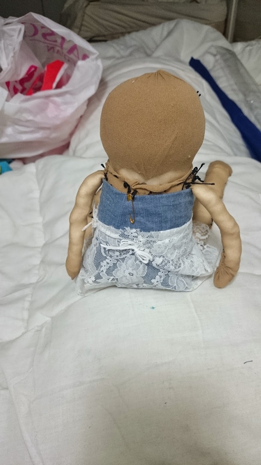
This is how she looks from the back.
This is her and a half-finished potato doll sitting side by side, already being great friends! Potato doll has a dress on!
This is a photo of potato doll with eyes, lashes, and a beautiful smile! I am probably going to call her Posey as it is the mash-up of my name and the word "potato".
POtato + caSEY = POSEY!!!:)
This is the back of Posey.
The front of Posey sitting down.
This is Posey finally with her blue hair. I used blue hair because it is my dream to dye my hair blue, but until now, it is still not fulfilled. Therefore, if I cannot have blue hair, then Posey shall be the doll version of me and have blue hair!
This is Posey looking sideways to show off her long hair.
This is Posey posing for the camera. (Pun intended)
I finally sewn in colourful doll Casey's lace tights! She looks so pretty in them, THANK YOU KATRINA KHAW for this amazing idea!!!
I might call her Dollsey, because Doll + CaSey = DollSey.
My 2 finished dolls. I am so proud of them, and judging by the large smiles on their faces, they are proud of me too!:)
~Week 4 to Week 7~
What is your SQUARE?
For this 2nd assignment, we have to do some paper cutouts again!!! Except it is much more difficult and smaller than when we did it in our Principles of Design (POD) class. By using our previously learned skills of paper cutting and all the other things we have learned in our previous semester in our POD class, we have to make a set of 2 paper cutouts in a square size of 4.5 x 4.5 inches, one square symmetrical and one square asymmetrical. All the pieces that we cut out from the square must not be thrown away but instead needs to be re-stuck onto the mounting board that we stick the square in, and this is the very tricky part for me, especially for the symmetrical square.
Miss Lisa said we need to make a story with our square. Our square will have feelings,just like normal humans. We created 3 sets of squares and Miss Lisa will help us to choose the square that is the best and has the best story. I went up to Miss Lisa and told her about my squares and their stories. My first squares were squares that are slowly growing to be matured. My second set are squares that are sad. My final square has wings because it has freedom. At first Miss Lisa quite liked my growing squares. But when she flipped the page and saw the symmetrical sad square, she loved it and she wanted me to do it. She looked at the winged squares but she was unimpressed as her heart was already set on the sad squares.
I went back home to work on the fully detailed draft design of my 2 sad squares, and I showed them to her on the following week. Miss Maslisa still loved the symmetrical designed square and she advised me to make some small changes for my asymmetrical squares. She also told me to rethink about my colour choice of red against the black mounting board of my squares.
With Miss Lisa's advise, I finally went back home and started on my final designs of my squares. I bought 2 different colours of blue as my colour choice, one for each square, to represent the feeling of "being blue", which means being sad, and also to represent the widely recognized animated colour of water to portray tears, which are usually shed out of sadness. It was very difficult work to cut out each and every small piece of paper, especially to match the symmetrical square to its mirror on the black mounting board, but I managed to do it! And I hope that Miss Lisa will love my squares as much as I do.
Here are some photographs I took during my process of choosing the theme to my finished cutouts:


We drew the ideas that we listed out:
1. Buildings
2.The World
(Top right: Same concept as the world but in food form, for example 1/4 pizza, 1/4 watermelon, 1/4 orange, etc.)

3. Cartoon characters(Different Techniques)


4. Skeleton
5.Ice-cream

Here are some photographs I took during my process of choosing the theme to my finished cutouts:
First, I wrote down all the possible themes that I can have for my cutouts.
This is the first theme I drew, which is the Groth theme. It shows a small plant growing from a tiny shoot to a matured tree.
This was actually a random drawing that I drew of the face of a sad girl to portray my second theme, Sadness. The sketch at the top of the page is the symmetrical square while the sketch at the bottom of the page is the asymmetrical drawing I was planning on doing.
These sketches were for the theme Tattoos(top) and Wings/Free(bottom). They were not very well drawn as I was not that good at drawing wings or designs for tattoos. I guess these drawings were my weak point, and I can see why Miss Lisa did not choose these themes for me.
I drew this drawing for the theme Wings. I quite like this sketch, but it was too complicated to cut out on a tiny square piece of paper.
Another very complicated and unorganized sketch of the Wings theme.
I sketched this for the Wings theme but it turned out more like the sun or a flower.
I drew this for the Sad theme after Miss Lisa chose the theme for me.

This is the finalized drawing of the symmetrical square for the theme Sad.

I drew this as the finalized sketch for the asymmetrical square for the Sad theme, and Miss Lisa accepted it.

After I showed Miss Maslisa the previous asymmetrical sketch, I showed her this sketch to see if she would rather have this as my asymmetrical instead, but she told me that the previous one would be better as I can construct the full face of the girl in the previous sketch.

This is my finished result of my asymmetrical cutout, I turned it this way so that it looks like the bottom square is a reflection of her in water.

This is the same cutout as in the previous picture, except I turned 180 degrees around so that her reflection is on top.

For my asymmetrical cutout, I tried many different methods to paste the cutouts that are outside the square. This is the first method I used, which are words. The words look like they are floating further away from her hair, and the words are "Feel My Pain".

This is the second method I tried for this cutout, it's basically extra pieces of her hair flying away. I almost chose this but I feel like there is something off about it.

This is another way I arranged the strands of cutouts, to show that there is a cloud raining down on her. I did not choose this as I realized that the rain and her hair clash and it is not logical that the wind blowing her hair and the wind blowing the rain are in opposite directions.

This is my finalized and pasted cutout of the asymmetrical square for my theme, Sad. I am very proud of this cutout, especially as I have tried so many methods to paste them and none of them worked. Finally, I thought of using the rain and hair methods and combining them, while placing the rain-cloud on the other side of the mounting board, so that the rain and her hair flows at the same direction. The raindrops can also seem to be strand of her long hair.
I am very happy with my theme and my cutouts. I think they are perfect and I hope that Miss Lisa will love them as much as I do.
~Week 9 to Week 11~
BATIK!!!!!!!
Week 9
(27 November 2014)
Today, we received a new assignment from Miss Lisa, and it is a group
work! We are to group up in groups of 4 people and come up with at least 3
themes to design for our batiks. I teamed up with Jannie, Cigie, and Katrina
for this assignment, and I am very satisfied with all my group members. We are
to present our theme ideas to Miss Lisa on the next day during class.
(28 November 2014)
As we had no time to discuss themes yesterday, we discussed on the
themes today during lunchtime. The four of us met up for lunch at Kung Fu's
Kitchen, a chinese restaurant to have lunch and also to discuss on some theme
ideas for class. We did not want our ideas to be too mainstream or too much
like normal batik prints that everyone is selling out at the markets. Instead,
we wanted to put a new twist to our designs that nobody would have thought to
put on batiks. We thought it would be difficult to think of some unconventional
batik ideas, but once we used our brain juices, the ideas kept pouring out one
after another. After we were done with jotting down our ideas, we rechecked our
list to see which ones we loved and which ones we do not really like, and it
turns out that we loved all the ideas, and we hope that Ms. Lisa would feel the
same way about our ideas too. After lunch, we went to the drawing room and
started to sketch down each idea for each theme. We also did some research
online, especially on Pinterest to find the perfect ideas to sketch down, and
we found a lot. Here are some examples that we found along with the list of
theme ideas we came up with:


The List of our Ideas written down:
The List of our Ideas written down:
Class time came, and we showed the ideas and the sketches to Miss Lisa.
Her reaction was much better than we expected! She loved all the ideas we gave to
her and just like us, she also had a very hard time choosing the perfect theme
for us too. At last, after a lot of evaluating and crossing out themes that
would turn out quite difficult for us to do (even though we loved those as
well), we all finally agreed on continuing with the Stacked Up Ice Cream theme.
The second choice would be the cartoon character idea, in which we drew out the
Powerpuff Girls. After we got the green light to proceed with our theme idea,
we went back home satisfied and overjoyed that we could have such a positive
reaction from Miss Lisa.
We drew the ideas that we listed out:
1. Buildings
2.The World
(Top right: Same concept as the world but in food form, for example 1/4 pizza, 1/4 watermelon, 1/4 orange, etc.)
3. Cartoon characters(Different Techniques)
4. Skeleton
5.Ice-cream
Week 10
(1 December 2014)
After 28 November, the group and I got together again to discuss on how to further enhance the theme. We actually tried quite a few ways to draw the ice cream scoops, and also researched online to find any drawings that are similar to our idea of the ice cream scoops. Our ice cream will be stacked up very high, so there will be four frames, one top, two middle, and one bottom. We cast lots to see who will get which part of the ice cream, and it turned out that we all happened to get the parts that we wanted, and I got the bottom part, which means that I have to cone! Finally, Jannie came up with the amazing idea to merge this theme and our second choice theme, which was cartoon characters, together to make a mash up. She did it in a way such that, since hers is the top frame, she had 2 row of scoops of ice cream coming up and connecting to the frame below, and then her final scoop on top is her favourite cartoon character, which is Hello Kitty. She even put some whipped cream and a cherry on top of the Hello Kitty scoop! So adorable! So, using her idea, we all had 3 scoops for each of our frames, and one of the scoops will have the face of our favourite charater. Starting from mine is a grumpy turtle, then comes Katrina's Toothless with his adorable tail and tongue sticking out, followed up by Cigie's Doraemon, and finally Jannie's Hello Kitty on top. In between those character scoops will be some normal ice cream flavoured scoops. My design was the grumpy turtle above the simple cone, followed by a blue Cookie Monster inspired scoop with 2 cookies sticking up from the side (one of them had a bite off of it, to create the impression that the Cookie Monster bit it off). The last scoop on top is a simple pink strawberry flavoured ice-cream scoop with red strawberry bits sprinkled on top of it, it looks like a pink jellyfish.
We showed our designs, along with the colours we wanted to colour or paint them in to Miss Lisa on the 1st of December during class, and she loved our improvised idea of the characters on the scoops. We were so happy that she loved the idea and went home happy once again. After that day, we drew our finalized version of our drawings and went to the library to print them from A4 size to A3 size as the batik cloths will be in A3 size.
The Ice-cream idea that we enhanced, I put a cookie monster at first:


After Jannie gave us the idea of the cartoon character on a scoop of ice-cream, I researched in Pinterest for a turtle to draw and used it in the bottom scoop, while still having cookie monster inside as the second scoop with cookies as the toppings and with blue as the colour of the ice-cream:
First draft on my notebook:
Second draft, this time on an A4 paper:
Coloured in second draft:
This is the Adorable turtle I found on Pinterest that I used to draw as my ice-cream scoop!!! Isn't it just the Cutest???:
(5 December 2014)
The day has come, the day of our batik trip. We gathered at the bus stop at the university before 8am to wait for the bus to come and fetch us to our destination. Some of us had already paid for the trip fees the day before, but I had not, so I went at around 7.50am and I gave the RM65 fees to our class representative, Chiang Shu Ling. While waiting for the bus, we were very excited and some of us took a few photographs. Finally, the bus arrived at around 9am and we all got onto it. We did this trip with our February batch seniors too, so some of them got onto the bus while the other half went onto a mini van, and we all started our trip once we were settled in the vehicles.
We arrived at our destination after more or less an hour, at around 10am. The staff started off by teaching us the basic techniques on how to use the wax to draw the outlines of our designs followed by the techniques on how to use the colours to paint on the batik cloth or canvas. After the brief explanation, we picked our own spaces and cloths and proceeded to start on our batik drawing. We pasted the A3 paper under the cloth and traced the outlines onto the canvas with a pencil, and we then used the wax to draw over the outlines of our designs. After that, we went to get the colours and a cup of water (for diluting the colours) and started on our batik colouring process. For my group, we were very careful to pick the right colours for our designs as we did not want our hard work to be destroyed by a single wrong, so we took quite some time testing out the colours, especially the browns and the yellows. Some of the designs also needed some colour mixing, such as Katrina's Toothless, which is a deep purplish black. After we finally got the right techniques and the right colours, we started on our colouring process. We managed to finish our entire batiks before we had to leave to go back to school. We were the second last group to leave the place as we are perfectionists and we stayed back a little bit to touch up on our work as we were still not satisfied of the outcomes of our batik, especially the leaks on the canvas where we thought we put enough wax on, but it turned out that we did not.
We had an amazing experience during this trip, and I feel very privileged and happy to get to experience how to make batik from scratch. The staff did help me on the waxing part though because some of my waxing was too thin and the wax was supposed to be thick so as the colours won't leak out. If I could do batik again, I definitely would, and I will try to make a much better job now that I know the mistakes I have made. I have also new-found respect and admiration for all the people who do batik, and using the freehand technique nonetheless! Batik is actually a difficult thing to master. The waxing part must be very fast and precise, and you have to be careful not to spill the wax accidentally as once you do, you cannot colour the area anymore and there will be a giant blob of white n the canvas when the paint dries and everything is washed. The worst part for me was the leaking of the paint, especially on the grumpy turtle's shell and tail area, and some of the strawberry chips. The colouring was also not as easy as you might think as you had to mix the colours right and it is very difficult to get a good gradient effect. There is also a technique in using water to erase the mistakes (not entirely, but just enough), and we did not realize that until it was too late and we had to leave, but we did manage to do some correcting right before we had to leave, although I do wish that I had known of that technique earlier.
We were not as satisfied with our work as we thought we would be, and we were devastated by the leakings, but then again, we underestimated the difficulty of batik making. Overall, it was a tiring yet amazing experience and I definitely would do it agai if I ever had another chance to do so. I went home tired and hungry, but my heart was happy and proud to have learned a new thing and experienced something new.
Week 11
(9 December 2014)
We received our batik prints from the batik factory, and we were sad at first as we could see some new stains or leaks on our prints, and most of our batiks were framed the wrong way. We were so worried that the framing work was permanent and we could not change it, but Thank God it turned out that upon further investigation, the prints were just staples onto the plastic frame and we could actually take them out and re-stapler them back again. Overall, it was not that bad. I was quite happy with how mine turned out, but some of my friends and group members were not too pleased with the extra leaks. I a only sad that my turtle's tail is quite ruined by the extra leaks, but apart from that, it was okay.
(12 December 2014)
We presented our batik prints group by group today, and my group was the third group to present. Miss Lisa was very happy with how our work turned out and that made us very happy. She loved how different our theme was compared to other batik prints and that the theme fits our personalities perfectly. She asked us to reflect back on our experience as a group, and we did.
Overall, our experience as a group had been amazing, and there is nothing we would want to change about our members. We have this friendship chemistry together as a team, and we agree on most things. Our personalities might be different, but somehow there are also similarities among the four of us. We all agreed on the ice cream idea and also the character innovation of it. Our experience might be tiring on the day of the batik making, but we also enjoyed ourselves a lot. We might want to change some things about our prints, such as clearing up the leaks and also making thicker wax lines, but there is very little, if not nothing at all that we want to change about our experience as a team.
My final outcome of Batik print:


My stenciling materials:


After 28 November, the group and I got together again to discuss on how to further enhance the theme. We actually tried quite a few ways to draw the ice cream scoops, and also researched online to find any drawings that are similar to our idea of the ice cream scoops. Our ice cream will be stacked up very high, so there will be four frames, one top, two middle, and one bottom. We cast lots to see who will get which part of the ice cream, and it turned out that we all happened to get the parts that we wanted, and I got the bottom part, which means that I have to cone! Finally, Jannie came up with the amazing idea to merge this theme and our second choice theme, which was cartoon characters, together to make a mash up. She did it in a way such that, since hers is the top frame, she had 2 row of scoops of ice cream coming up and connecting to the frame below, and then her final scoop on top is her favourite cartoon character, which is Hello Kitty. She even put some whipped cream and a cherry on top of the Hello Kitty scoop! So adorable! So, using her idea, we all had 3 scoops for each of our frames, and one of the scoops will have the face of our favourite charater. Starting from mine is a grumpy turtle, then comes Katrina's Toothless with his adorable tail and tongue sticking out, followed up by Cigie's Doraemon, and finally Jannie's Hello Kitty on top. In between those character scoops will be some normal ice cream flavoured scoops. My design was the grumpy turtle above the simple cone, followed by a blue Cookie Monster inspired scoop with 2 cookies sticking up from the side (one of them had a bite off of it, to create the impression that the Cookie Monster bit it off). The last scoop on top is a simple pink strawberry flavoured ice-cream scoop with red strawberry bits sprinkled on top of it, it looks like a pink jellyfish.
We showed our designs, along with the colours we wanted to colour or paint them in to Miss Lisa on the 1st of December during class, and she loved our improvised idea of the characters on the scoops. We were so happy that she loved the idea and went home happy once again. After that day, we drew our finalized version of our drawings and went to the library to print them from A4 size to A3 size as the batik cloths will be in A3 size.
The Ice-cream idea that we enhanced, I put a cookie monster at first:
After Jannie gave us the idea of the cartoon character on a scoop of ice-cream, I researched in Pinterest for a turtle to draw and used it in the bottom scoop, while still having cookie monster inside as the second scoop with cookies as the toppings and with blue as the colour of the ice-cream:
First draft on my notebook:
Second draft, this time on an A4 paper:
Coloured in second draft:
This is the Adorable turtle I found on Pinterest that I used to draw as my ice-cream scoop!!! Isn't it just the Cutest???:
(5 December 2014)
The day has come, the day of our batik trip. We gathered at the bus stop at the university before 8am to wait for the bus to come and fetch us to our destination. Some of us had already paid for the trip fees the day before, but I had not, so I went at around 7.50am and I gave the RM65 fees to our class representative, Chiang Shu Ling. While waiting for the bus, we were very excited and some of us took a few photographs. Finally, the bus arrived at around 9am and we all got onto it. We did this trip with our February batch seniors too, so some of them got onto the bus while the other half went onto a mini van, and we all started our trip once we were settled in the vehicles.
We arrived at our destination after more or less an hour, at around 10am. The staff started off by teaching us the basic techniques on how to use the wax to draw the outlines of our designs followed by the techniques on how to use the colours to paint on the batik cloth or canvas. After the brief explanation, we picked our own spaces and cloths and proceeded to start on our batik drawing. We pasted the A3 paper under the cloth and traced the outlines onto the canvas with a pencil, and we then used the wax to draw over the outlines of our designs. After that, we went to get the colours and a cup of water (for diluting the colours) and started on our batik colouring process. For my group, we were very careful to pick the right colours for our designs as we did not want our hard work to be destroyed by a single wrong, so we took quite some time testing out the colours, especially the browns and the yellows. Some of the designs also needed some colour mixing, such as Katrina's Toothless, which is a deep purplish black. After we finally got the right techniques and the right colours, we started on our colouring process. We managed to finish our entire batiks before we had to leave to go back to school. We were the second last group to leave the place as we are perfectionists and we stayed back a little bit to touch up on our work as we were still not satisfied of the outcomes of our batik, especially the leaks on the canvas where we thought we put enough wax on, but it turned out that we did not.
We had an amazing experience during this trip, and I feel very privileged and happy to get to experience how to make batik from scratch. The staff did help me on the waxing part though because some of my waxing was too thin and the wax was supposed to be thick so as the colours won't leak out. If I could do batik again, I definitely would, and I will try to make a much better job now that I know the mistakes I have made. I have also new-found respect and admiration for all the people who do batik, and using the freehand technique nonetheless! Batik is actually a difficult thing to master. The waxing part must be very fast and precise, and you have to be careful not to spill the wax accidentally as once you do, you cannot colour the area anymore and there will be a giant blob of white n the canvas when the paint dries and everything is washed. The worst part for me was the leaking of the paint, especially on the grumpy turtle's shell and tail area, and some of the strawberry chips. The colouring was also not as easy as you might think as you had to mix the colours right and it is very difficult to get a good gradient effect. There is also a technique in using water to erase the mistakes (not entirely, but just enough), and we did not realize that until it was too late and we had to leave, but we did manage to do some correcting right before we had to leave, although I do wish that I had known of that technique earlier.
We were not as satisfied with our work as we thought we would be, and we were devastated by the leakings, but then again, we underestimated the difficulty of batik making. Overall, it was a tiring yet amazing experience and I definitely would do it agai if I ever had another chance to do so. I went home tired and hungry, but my heart was happy and proud to have learned a new thing and experienced something new.
Week 11
(9 December 2014)
We received our batik prints from the batik factory, and we were sad at first as we could see some new stains or leaks on our prints, and most of our batiks were framed the wrong way. We were so worried that the framing work was permanent and we could not change it, but Thank God it turned out that upon further investigation, the prints were just staples onto the plastic frame and we could actually take them out and re-stapler them back again. Overall, it was not that bad. I was quite happy with how mine turned out, but some of my friends and group members were not too pleased with the extra leaks. I a only sad that my turtle's tail is quite ruined by the extra leaks, but apart from that, it was okay.
(12 December 2014)
We presented our batik prints group by group today, and my group was the third group to present. Miss Lisa was very happy with how our work turned out and that made us very happy. She loved how different our theme was compared to other batik prints and that the theme fits our personalities perfectly. She asked us to reflect back on our experience as a group, and we did.
Overall, our experience as a group had been amazing, and there is nothing we would want to change about our members. We have this friendship chemistry together as a team, and we agree on most things. Our personalities might be different, but somehow there are also similarities among the four of us. We all agreed on the ice cream idea and also the character innovation of it. Our experience might be tiring on the day of the batik making, but we also enjoyed ourselves a lot. We might want to change some things about our prints, such as clearing up the leaks and also making thicker wax lines, but there is very little, if not nothing at all that we want to change about our experience as a team.
My final outcome of Batik print:
All of us next to our prints!:D
~Week 11 to Week 14~
Monograms and Logos
Week 11
(12 December 2014)
After we were done with presenting our Batik prints, it was time for us to create our very own logos!!! Yay!!!!!!! This is one of our major assignments too, apart from the Batik assignment. But for me, this one is more challenging as this is an individual assignment, and instead of printing on one thing, we have to print our logos on 6 different kinds of materials or things, and print out a pattern and a poster of our logo onto A3 papers and mount them on mounting boards.
Miss Lisa started the class by giving us a short lecture on what monograms and logos are. Then she followed it up with lots of examples of monograms and logos, and also some examples from our seniors. She then explained on what we should do and what the requirements for this assignment are. Step one is for us to do some research on the various styles of logos and find out what our own styles are. So, she sent us off to the library to look at the books there to find inspirations of what kind of style we want for our logo. We spent around half an hour to one hour searching and taking photographs of the logos that we like, and then we went back to class after that for our next step.
Step two is to determine the name of our style. In our own little groups, Miss Lisa told us to share the pictures of the logos we have taken in the library books with our friends, and our friends will have to come up with a word to describe our style of logo. Then, Miss Lisa and the whole class would listen to that word from our friends, and decide if that is the right style for each of us.
After I shared my photographs with my friends Katrina, Cigie, and Jannie, they came up with the word "Doodle". Miss Lisa and the entire class agreed that that was definitely my style. So it was decided that my style was to be named "Doodles".
After everyone's style had a name, class was dismissed and we all went back home to cook up some ideas for the logos we want that is our style.
These are the photographs I showed to my friends to determine my logo style:
Week 12
(15 December 2014)
Monday has come, and another class for 2D-Design has come again. This time, we did not go to class empty handed. We all brought along our sketches and ideas for our respective logos. Mine was doodley all over, as my style was Doodles. One by one, each of us showed Miss Lisa our sketches. I had a lot of pages of logo sketches. When it came to my turn, I was so nervous as I was afraid that none of the sketches I came up with would be nice. When Miss Lisa saw them, she liked 2 of the sketches and asked me to go home and come up with more ideas of the two types of logos that she had picked.
Over the weekend, I did research on monograms and logos of CC, as that was my initials. I went on pinterest to get my inspiration, and here are a few logos that I fell in love with:
These are all my sketches:
The two that Miss Lisa chose for me are the top right ones from the 2nd and 4th photo, both are ticked.
19 December 2014
We went back to class on Friday to show Miss Lisa our improved sketches again. But first, Miss Lisa showed us two videos on how to stencil our logos onto the materials. There are two ways, the sponging or dabbing way, or the spray-painting way. I choose to use the sponging way as I have seen a lot of YouTubers use that way, and I had always wanted to do sponge stenciling. Now I can! After the two videos, we then showed our improved sketches to Miss Lisa. I also added a few more of my sudden brainstorms, including a turtle idea, a donut idea, a suitcase idea, and a mini pouch bag idea. Miss Lisa loved my new ideas too, she especially loved the donut idea and also the turtle idea too, so she asked me to go back to my seat and come up with some more ideas for the new sketches. I sketched a few more ideas for those, and let her see them again. On one of my sketches, I merged the turtle idea and the donut idea together, and she loved it a lot, so at last, Miss Lisa chose that idea for me. I am very happy with the logo that was chosen, so I had no complaints about it and happily went back to my seat. Shortly after that, class was dismissed and we all went back home to come up with 6 materials to print our logos out on, and also to come up with the stencils and colours of our logos. I am a vibrant person, so obviously I would choose some colourful colours.
My sketches:
Do you see the donut sketch?
The suitcase sketch?
The pouch bag sketch?
And... The turtle hugs donut sketch that i later added on???
Week 13
(29 December 2014)
Our course had a one week break between 20th to 28th December as it was the Christmas week. That week, I came up with the list of things I want to print my logo on, and also the colour of my logo. I also went shopping and bought all the necessary materials for my logo stenciling project. After that, I started to design my stencils, and consulted Miss Lisa if my stencils are okay through Facebook Messenger. I then proceeded to cut out my stencils on some A4 clear sheets.
Then Monday came and we showed Miss Lisa our cut out stencils. She approved of mine. She then asked what colour I planned to do my stencil as, and I said 2 different shades of green, as the logo is 2 turtles, but Miss Lisa told me to pick more vibrant colours and to play around with the colours, so I thought long and hard, and came up with 2 opposite colours, one a warm colour, and one a cold colour, but both vibrant in their own ways. Orange and Turquoise!!!
My cut out stencils for the 6 objects:
I drew the top ones to see if they were nicer, but I still like the donut turtles:)
First stencil I sketched. Not quite good enough.
(2nd January 2015)
During the three days between 29 December and 2nd January, I went shopping for sponges and the acrylic colours for my stencil.
Friday came and it was time for me to stencil my logo on the 6 items! It was exciting but terrifying at the same time as I had never done stenciling before, and I totally forgot of the fact that I could actually try it out at home first, so I tried out my first stencil on a piece of paper from my notebook, and for my first try, it was pretty good. After a few more tries, I decided that I could do it for real, and I started with my real materials. I managed to stencil on 7 objects, and then it was time for class to be dismissed. I waited for my stencils to dry, and I went home. Time for my poster and my pattern next!
My logos in all their glory!!!:
Transparent Tablet case and Phonecase
Back of a mirror
DiY Jean-material pouch and Notebook
Paper bag
Ziplock bag and Paper bag
Plastic ziplock bag
Everything together.
My stenciling materials:
Sponges with handles, the 2 acrylic colours, and my cut out stencils on the transparent sheets
Week 14
(5th January 2015)
During the weekend after class on Friday, I cut out the stenciling for the poster and pattern, and also went and bought the materials needed for the pattern and poster logos. I then spent a lot of time doing the poster and pattern. I am very proud of my work. My materials and results are as shown in the photographs below:
My stencils for my pattern.
I followed the lines of the drawing here to draw my stencil onto the transparent paper.
Stencils for my poster. I put the two pieces of stencils together, one overlapping the other.
Separated stencils for my poster.
Get ready for the results!!!!!!!:
.
.
.
.
.
.
.
.
.
.
.
.
.
.
.
.
.
.
.
Drumroll!!!!!!!!!!!
.
.
.
.
.
.
.
.
.
.
.
.
.
.
.
.
.
.
.
.
.
.
.
.
.
.
.
.
.
.
.
.
.
.
TaDaa!!!:
Poster, on black and on white.
Pattern, on black and on white too.
All the stencils as a whole!!!:)
Miss Lisa liked the black background poster and white background pattern, so these are the finalized set of my monogram logos.
Overall, I am quite proud of myself for a first-timer in stenciling. I love how it all turned out great and Miss Lisa loved them too! I am so happy and relieved that she likes them and that I did not let her down. This was an amazing experience for me, and I have grown to love stenciling! One last assignment to go!!!!!!!
~Week 14~
Painting with Music!!!
(5th January 2015)
Right after we all presented our monograms and logos, and Miss Lisa had taken photographs of everyone's stencil logos, we packed up our materials, and proceeded to do this next assignment, Painting with Music!
This is the final assignment to do for our Foundation in Design. And it only required 2 hours and it was done. All we need was painting materials, 2 playlists of music, and ourselves. This assignment is all about letting our feelings flow and not using our brains to think too hard. Miss Lisa compiled a list of classical instrumental songs in one playlist, and us students compiled another list of songs of any genre, instrumental or normal.
This is the awesome song that I contributed to the playlist:)
Name: Main Theme (Goat Simulator)
Artist/Maker: Coffee Stain Studios
It is actually the main theme song of a game called Goat Simulator by the game-makers from Coffee Stain Studios. It's a very fun and uplifting non-vocal music. I suggest you listen to it :D
Miss Lisa will first play our list, and we will each paint according to our feelings while listening to the songs for one hour. After that, we repeat that process for another one more hour, but this time with Miss Lisa's classical playlist.
This is me right before painting on my blank A1 watercolour paper. Take note of my nervous smile:
This photo was taken by Cigie, who was sitting beside me, on my right.
Katrina was sitting on my left.
Here are my 2 results, first from our playlist, and then from Miss Lisa's playlist:
The painting from the first playlist, the random playlist!
My painting from Miss Lisa's classical playlist!!!
I like the photographs with the purple at the bottom better.
Both my paintings side by side.
I first thought that I could not paint and that my paintings would be very ugly, and I had a fear that I could not paint with what I feel while listening to the music. I was very afraid that I would get what I would call a "painter's block", but thankfully, I realized that a few seconds or one minute into the first song on the playlist, I started to paint naturally, without thinking too hard. This was a very fun experience, and I feel like I get better with each stroke. I can also sense myself get into more ease the more I do it, for example I feel like my second painting was better than my first as it felt less forced, and because for the first painting, I felt a bit pressured, and I was only half listening to my heart during the first few songs, but as I grew more into the painting and music, I felt more at ease, and I could paint more naturally.
I started not knowing what to do and dreading this assignment, but ended up loving and enjoying it. Even though it was a tiring day for all of us, it was a great and enjoyable day.
Thank You Miss Maslisa for having so much patience and care to teach each and every one of us. You leave amazing memories in our hearts, and our foundation time with you had been awesome and extremely memorable - very unforgettable!!! We will miss you greatly! I will miss you greatly!!!!!!!
No comments:
Post a Comment